How I increased clickthrough rates on a single button by optimising the text, and nothing else.
In this article I'm going to describe how I managed to increase sales on one of my websites massively, simply by changing the words on a single button. To provide a bit of context, I'll tell you the story behind it.
Ten years ago, when the only consideration when designing websites was 'how great it looked', I stumbled across a blog post by Bryan Eisenberg, who (along with his brother Jeffrey) were championing a revolutionary new methodology called 'Persuasion Architecture'. It changed my life forever, and has been responsible for helping my company's profits grow substantially.
Unfortunately, that original blog post is no longer to be found on the web, but I'll never forget the impact it had on me.
Being someone with more than a passing interest in psychology, it piqued my curiosity, and I just HAD to find out more about it.
Here was a framework of recommendations and actions that website owners could put into practice on their website that could potentially boost the number of user 'conversions', whether that's buy a product, fill in a form, download a white paper, click on an banner ad, or even just read an article.
The fundamentals of 'persuading' your users to take the desired action seems simple: understand your users and take action. Find out who they are and what motivates them. Use this knowledge to map their journey as they use your website, placing strong calls-to-action in strategic places, addressing their concerns and 'pain points', and use language that resonates with them.
"Sounds fairly simple", I thought. However, the journey of enlightenment took six months. There was so much to learn. Every stone I turned over revealed more stones, and underneath every stone there was a nugget of gold. The more I learned about this powerful new methodology, the more thirsty I became for knowledge of Persuasion Architecture. It felt like I had opened Pandoras Box, and I wanted more and more.
Luckily, my job was Online Marketing Manager at an price comparison dot com up in Liverpool at the time, and the MD was more than happy for me to quench my thirst for this exciting new concept, given that it could potentially mean more customers. More customers = more profit, so it was a win-win situation for both of us.
One of the many areas of Persuasion Architecture involves looking at how the wording on website buttons can be changed subtly to increase the percentage of clicks. Get the wording just right, using more powerful and persuasive words and watch as the conversion rate rises dramatically.
It sounded too good to be true. Yet, time and time again by optimising the button text I would consistently see conversions increase, sometimes with the tiniest of changes to the text. At the price comparison company, we saw an overall increase in customers of almost 500% by implementing these subtle changes, although I should add that there were other techniques that I also implemented on the website.
I was hooked! Fast forward ten years to today and this method still astounds me. When putting together a website it's so easy to overlook the humble button, and just label them with 'Click Here', or 'Submit', 'Buy' or 'Contact Us'.
Sure, these buttons will get sales/conversions, but you're really not making the most of their potential. There is an opportunity to increase your conversion rate quite dramatically by understanding the motivations of your users, manage their expectations, add value and motivate them into that all-important "CLICK"- all in just a handful of words and a little knowledge of your target market.
Let's say, for example, that you get 1,000 people to your landing page each week. You've got a wonderfully prominent call-to-action button labelled 'Buy Now' that currently converts 10 visitors into customers, and it's placed directly in the path of your potential new customer.
Brilliant, you might say. Now we're in business. Sure, that's a start - a 1% conversion rate. Now, what would happen if you could convert 4% instead of 1% by changing the text on your call-to-action button? Sounds like a negligible, and relatively easy increase, right? If you agree, then you're right.
But also, let this sink in: by increasing your conversions from 1% to 4%, you're QUADRUPLING your customers, revenue and profits. No huge marketing spend, no big fancy advertising campaign and very, very little effort involved, apart from ten minutes of your precious time, and a knowledge of your most prized possession - your target market.
Very recently I undertook my own test experiment. Anyone that knows me will tell you that I harp on about testing, testing, testing. I'm a massive advocate of split testing - because it works. One of the websites in my portfolio contains pages showing local hotels. I act as an affiliate for a couple of major hotel websites, so I get commission whenever someone books a hotel room through my website. It's passive income and it has done very well since I integrated the hotel booking facility within the website.
Anyway, by adding the hotels to my website earlier on in 2015 I was generating on average around £25,000 in room sales per month. Not bad, but as I said I'm an advocate of split testing, and I wanted to know if I could increase that further by optimising my button text.
My original call-to-action button was 'Details & Availability' as we can see below, which was fine(ish). It was better than 'Click Here', anyway.
Ten days ago I changed the button slightly to the below version. I elaborated a little more to show the user extra information (managing expectation), as well as adding a calendar icon (creating a obvious connection). This, I felt, would entice more people to click on the button as it seemed like a natural progression that would answer the user's next question once they have found a hotel they liked: "Is it available on the dates I require?".
Here are the two buttons (the original and the new) side-by-side. Ten minutes deep in thought is all it took to rethink the button.
Original Button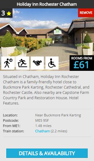 |
New Button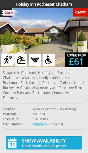 |
First, a massive disclaimer. Ten days results are NOT conclusive, they are barely indicative. In fact, ten days is nothing, even if I AM analysing data from thousands of visitors. In order to perform definitive tests you need to understand your market, as well as identify other factors that may be at play here. And you need to analyse results from a much longer timeframe. Please bear that in mind. But...
So far*, the clickthrough rate increased by a whopping... 45 percent!
* It's too early to say that the button text alone was responsible for this huge increase in clickthrough rates. Perhaps more people are wanting to book hotels for their Christmas break in early November. Could Google be sending the site more 'quality' traffic (not unheard of). Perhaps it's a fluke. The only way I'll find out is to continue to monitor the clickthrough rate. If anything changes, I'll update this post, or perhaps even delete it, if the increase is due to some embarrassing coincidence!
But, statistics rarely lie, especially if you have enough of them. I'm an optimist, but also a realist, and the test show that this figure may be 100% spot on.
I'm assuming that you've already optimised the button colour, placement and font sizes already (you HAVE done split tests for these, haven't you?).
If you want to give button text optimisation a go, which I thoroughly recommend, then follow these basic guidelines. What have you got to lose?
There are many, many more ways to optimise your button text. These are just a handful that I am confident will work for you. Google 'optimise button text' for a million more suggestions.
Also realise that what works for one website doesn't automatically mean it'll work on another. Your website visitors will be different to mine, with different 'pain points', different motivations and goals. That's why you need to test out different versions until you hit on something that works for you.
So, what next for me? Well, I never rest on my laurels. Once I have more substantial analytics I'll probably tweak the text further. Don't ever assume that you can't increase clickthroughs any further, because inevitably you'll find something else that works even better.
Test, test, test. That's all you need to know.
Don't risk it all. Remember, if you're not confident, perform the split test on a low percentage of your users (perhaps as little as 10%), so that you're not jeopardising your sales.
Good luck, and let me know how you get on.
Chris

Chris Haycock is the founder and CEO of CliqTo. He started his digital publishing business in 2004 with the launch of BritEvents, and since his journey began has built a significant portfolio of 30+ websites, including ZoomLocal, Visitr, Traffic Update, Who Shall I Vote For?, Postcode Area and more. ONE in SIX of the UK population has used his websites in 2017.
Thursday, October 12, 2017
Sometimes we get into such a deep rut with our business that we run out of ideas for …

Friday, January 13, 2017
Congratulations, your website looks great. 'But why am I not getting more sales and/…

Tuesday, October 4, 2016
SEO has taken a big hit over the last few years. That doesn't mean you can rest on y…

Tuesday, August 9, 2016
Is your "Contact Us" page working hard for your business or is it a lazy salesperson …

Monday, May 9, 2016
Thinking about starting a web design business? It seems that everyone wants a slice o…

Tuesday, February 9, 2016
My company's profits soared when I introduced meditation on a daily basis - whilst I …

Tuesday, December 8, 2015
Can I reach a thousand sustainable visitors a day with no marketing spend on GovWire?…

Friday, December 4, 2015
Why I decided to create a new government announcement portal after I had visited thei…

Friday, November 20, 2015
Make 2016 a more profitable year online - our founder is choosing three businesses to…

Friday, July 3, 2015
Some things in life get a little mouldy, out of date and lifeless if they're not look…
Comments